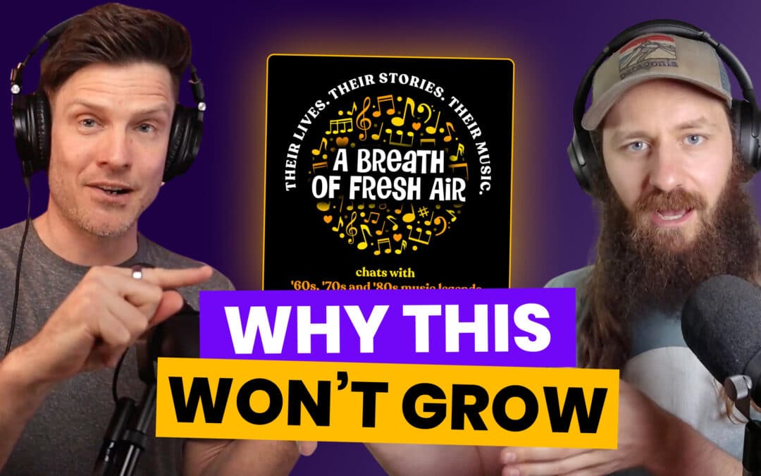
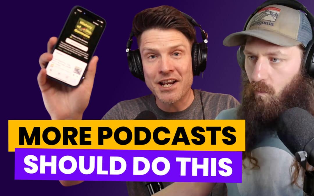
In this episode of Podcast Marketing Trends Explained, we roast Meredith Brasher’s Insurance vs History podcast’s packaging.
We break down what’s working, what’s not, and what you can learn to improve your podcast cover art, title, show description, SEO, and episode titles to improve your podcast discoverability and get more listeners.
Specifically, we discuss:
- The importance of first impressions
- The balance of an intriguing name paired with a compelling description
- The impact of host visibility for better connection with the audience and building credibility
- How she could be losing viewers without taking advantage of custom episode art
- And lots more
Listen in Apple | Spotify | Everywhere Else
Topics Covered
0:00 Intro
01:08 First impressions: Analyzing the podcast’s cover art & title
04:06 Why is this boring topic so intriguing?
05:06 How the description can better draw listeners in
14:18 Using Anchors & Associations to help listeners understand your show
18:10 Using the author tag to reinforce host credibility
24:25 Why your background as a host matters & how to leverage it
25:33 Unpacking the simple but enticing episode titles & why they work
29:10 Using teaser or trailer episodes to give people a taste of your show
30:05 How this show could leverage custom episode art
34:19 How we would market a story driven show to increase listenership
40:30 Real-time cover art experiments
Resources
Subscribe to Insurance vs History
Subscribe to Podcast Marketing Trends Explained
Explore the full Podcast Marketing Trends 2023 Report


