If there’s one practice that is central to the eventual success of your marketing, your show, and your business it’s experimentation.
From marketing tactics and strategies to episode formats, show concepts, titling (at both the show and episode levels), show description, cover art, and more, there are dozens of variables that each play a role in attracting, hooking, and retaining new listeners.
With infinite possibilities for each variable, it’s safe to assume that your current version is not the best option.
Which is where experimentation comes in.
One of the most glaring differences between how the hosts of big vs small shows operate is the amount and frequency of experimentation the (now) big shows employ—and have employed since they started.
Most of the experiments are failures, mind you.
But making a habit of regular, consistent, methodical experimentation is the only way to truly arrive at the best, most listenable, most marketable version of your show.
To give you an idea of what the experimental process might look like for your show, today, I want to share a case study of an experiment run by one of my Podcast Growth Engine clients, Sam Webster Harris (no, not that Sam Harris).
Sam is the host of Growth Mindset Psychology (formerly Growth Mindset Podcast) which he’s been publishing since 2017.
Since we’ve started working together, Sam has experimented extensively with his show, tweaking his:
- Episode titles
- Show description
- Episode format
- Episode length
- Episode release cadence
- Episode artwork
- And more
But in this case study, Sam breaks down the specific process he went through to update his podcast cover art, including an initial refresh that caused his downloads to plummet… and then another that unlocked significant new growth.
Over to Sam.

Back in March, I ran an experiment.
I’d been using the same cover art since starting my show, and after some feedback from Jeremy and others, I wanted to update it to feel more modern, serious, and legitimate.
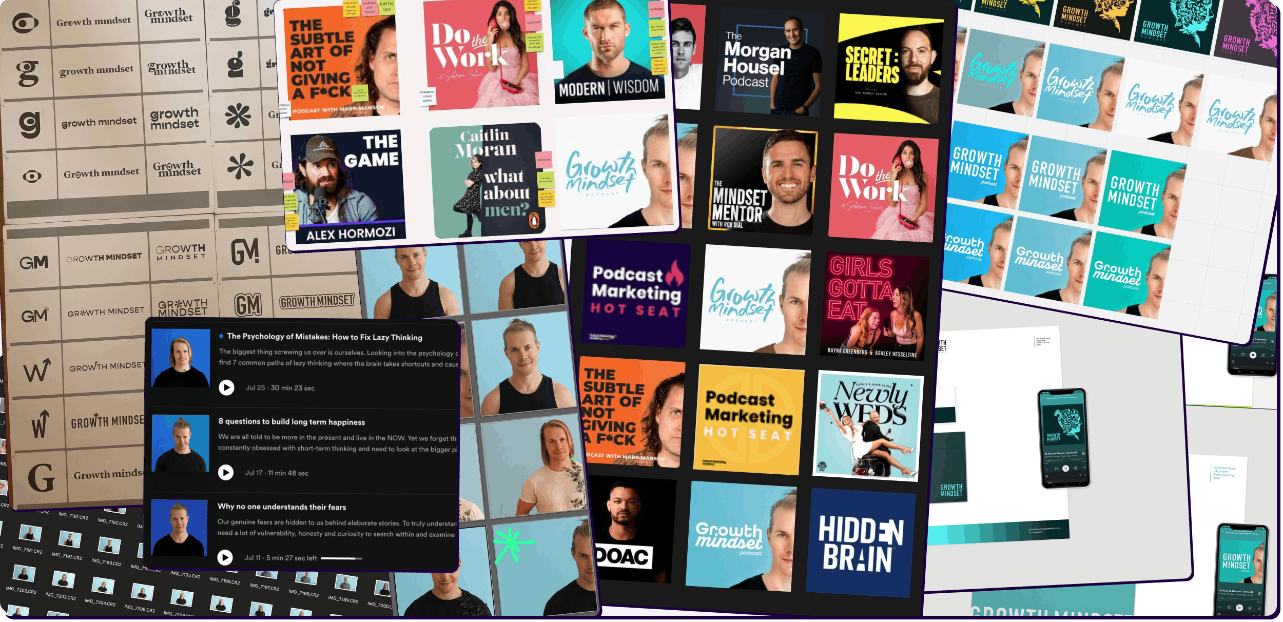
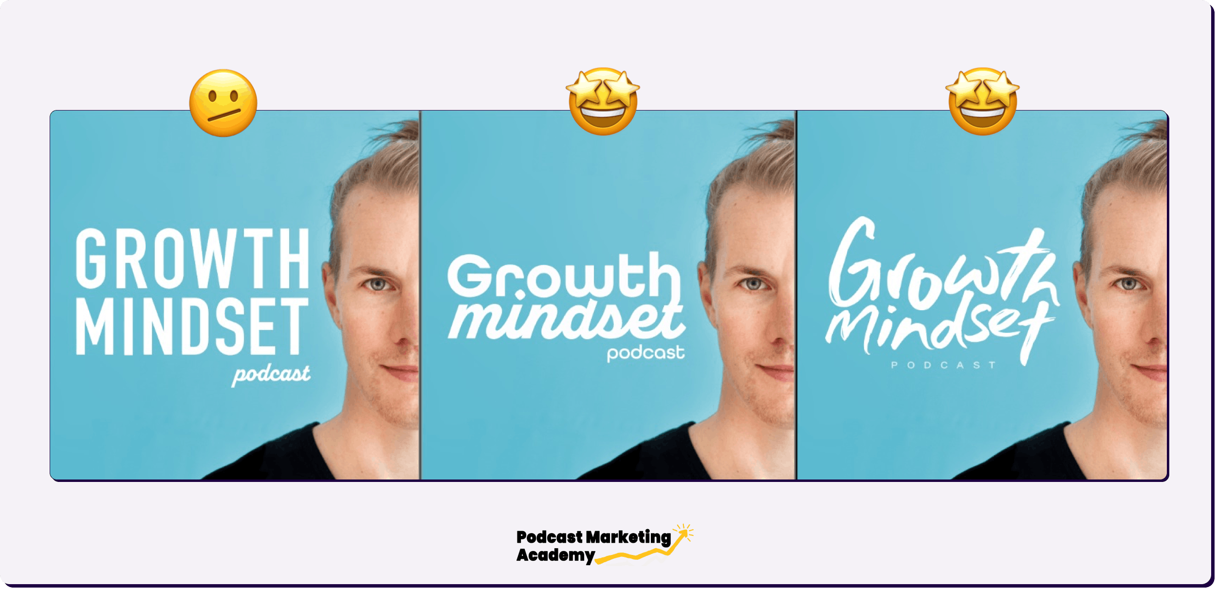
I spent dozens of hours working with my designer, Francisca to come up with multiple brand concepts, logos, mockups, and more.
Here’s just a bit of the sawdust the process produced.
Throughout the process, I presented the new concepts to friends, family and my network for feedback, and was convinced that I was on the right track… despite some pushback from my designer and a handful of friends and listeners.
Nevertheless, most of the feedback confirmed what I thought the design should be, and so I pressed on.
The result of the redesign was a shift from the cover art on the left to the one on the right below.
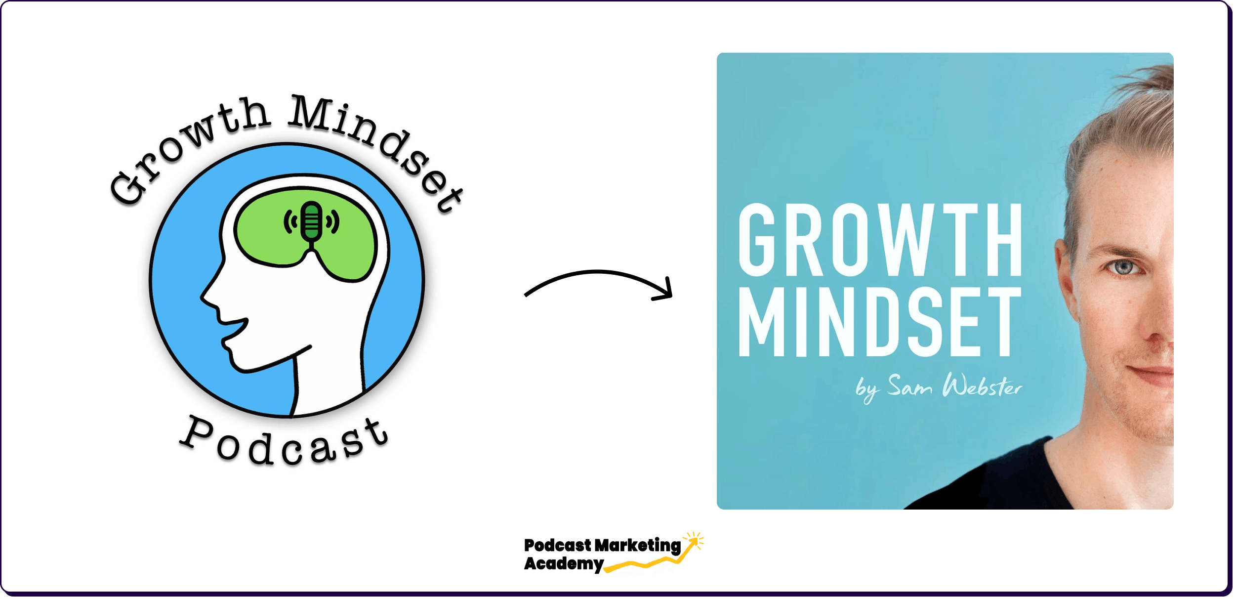
Big improvement right?
From a design perspective, maybe. But from an audience perspective… not so much.
In fact, almost immediately after changing up the cover art, my numbers cratered.
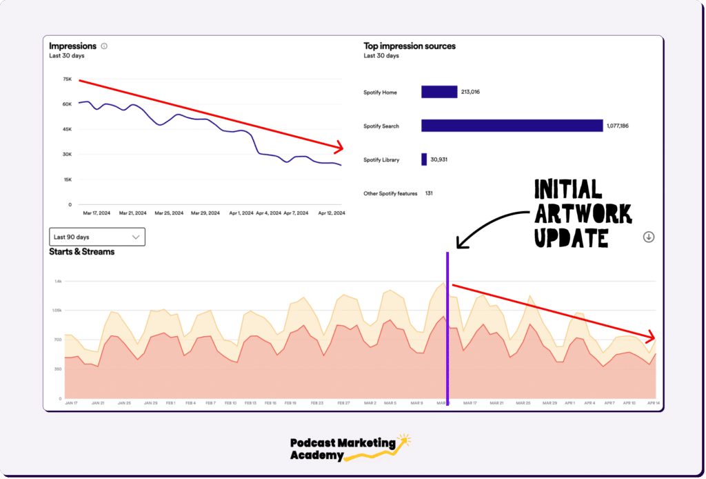
After 30 days, my Spotify impressions had dropped down 60% and my plays were down 50%—wiping out all growth from the 3 months before that.
Bonus insight — Apple plays stayed the same but new listener growth dropped, suggesting the content itself was fine. Spotify is much more suggestion-driven, however even for current subscribers, hence the drop there.
After a month of tense waiting, hoping the numbers might stabilize (they didn’t…) I reverted back to my previous cover art, and my numbers soon recovered.
I was relieved at the recovery… but I had a feeling (which Jeremy confirmed in his audit of the show) that while the new cover art hadn’t worked for my audience or my show, my existing cover art was likely still hurting my ability to attract new listeners.
And so a few months later, I decided to run a new cover art experiment and to do it right this time.
Podcast Cover Art Experiment: Take 2
Learning from what went wrong with the first I developed some hypotheses on the audience and vibe they were looking for.
Unlike my first experiment where I spoke with non-listener family and friends, this time—after a conversation with Jeremy about running Listener Clarity Calls—I put a booking link in the show notes of every episode and spoke via Zoom with 20 actual listeners of the show to get a better idea of what they like about the show and what they were looking for when they found it.
The insights from these calls were illuminating.
The two most common things listeners told me were:
- How calming I was to listen to
- How actionable the show was
Both of which they found “weirdly motivating”.
Listeners had often read all the leading self-help books (Dale Carnegie, Atomic Habits, Simon Sinek, The Power of Now), and while they would be immediately motivated after finishing a book, that feeling would soon tail off.
They told me that through the podcast, I provided an extra level of actionable detail that they didn’t get from the books. Another benefit was the regular cadence that had variety, but also consistency.
When I asked about other podcasts they listened to, they told me how others they’d tried often felt opinionated and preachy and how they appreciated how mine was a digestible resource of new ideas from real science with some very relatable and curious takes.
I can’t overstate how valuable these calls were.
In addition to the direct feedback and quotes, I was to get a window into who my real human listeners actually were.
Hearing real people describe the actual impact they get from the show was incredibly motivating for me.
No lie, a genuine quote from one listener clarity call with an entrepreneur:
”I felt like a sailboat with the sail fully open but with no rudder. When I listen to your podcast – the person within me, the warrior in me, is screaming to get out…you have been a spark to the powder keg inside me”
Totally nuts, and a healthy reminder not to mess this up.
Listener research in hand, I figured I would get back on the horse and attempt some smaller updates to the cover art and brand and work up from that.
Here’s the experiment I developed.
Primary Goals Behind My Podcast Artwork Experiment
Going into the experiment, I had two primary goals:
- Grow Listenership.
- Push the vibe toward a more sciencey and psychology-related field
In addition to the primary goals, I also had the following secondary goals:
- Increase clickthrough to artwork and listener engagement.
- Have a better image I feel more comfortable with and confident in
The Experiment Hypothesis
My initial cover art experiment was a massive change that meant existing listeners didn’t even recognize the show in their feeds.
What’s more, the vibe was a huge change, going from cute (maybe a little dorky) cartoon to my face looking stern (and as some of my female friends told me, even intimidating) staring back at them.
Sure, the new artwork looked professional and in line with my category… but it also felt more “Mindset Bro” than “Curious Scientist”. Neither the designer nor I had chosen the final design as our favourites but my network pushed us to choose that one for readability. 🙈
This was a mistake.
For example – I personally prefer both of the other two custom fonts she made that are more playful and better represent the show.
That said I suspect the photo was the bigger issue and in hindsight, I also would have opted for a happier face…
Regardless, this time around I wanted to take a more measured approach.
I knew there were problems with the current design… but what I heard from listeners was that it also had a vibe that was likeable and approachable.
What’s more, it was (perhaps accidentally) quite distinctive when compared with other artwork in my category.
Not being a designer, I had no idea what the specific problems were, but Jeremy provided some very good design recommendations in my audit that aligned with the designer’s opinions.
The hope was that I could improve the artwork while retaining the existing brand identify to make the show more attractive to new listeners while not putting off my existing audience.
Changes Made to My Podcast Artwork
Updated Cover Art Design including:
- Capitalized Sans-serif font with some customizations to make it look more natural
- Shadings improved and the microphone made to stand out better.
- Background colour changed to off-white to help it stand out from white backgrounds and look like a finished logo
- Removal of shadows (non-designers always think a shadow helps – designers will tell you that you’re dumb)
- Officially changed the name from Growth Mindset Podcast to Growth Mindset Psychology to attract and appeal a more sciency, less woo-woo crowd. The show content itself is highly science-based and my listener conversations revealed that many people were skeptical or put off by traditional self-help, self-development, and “mindset” related content
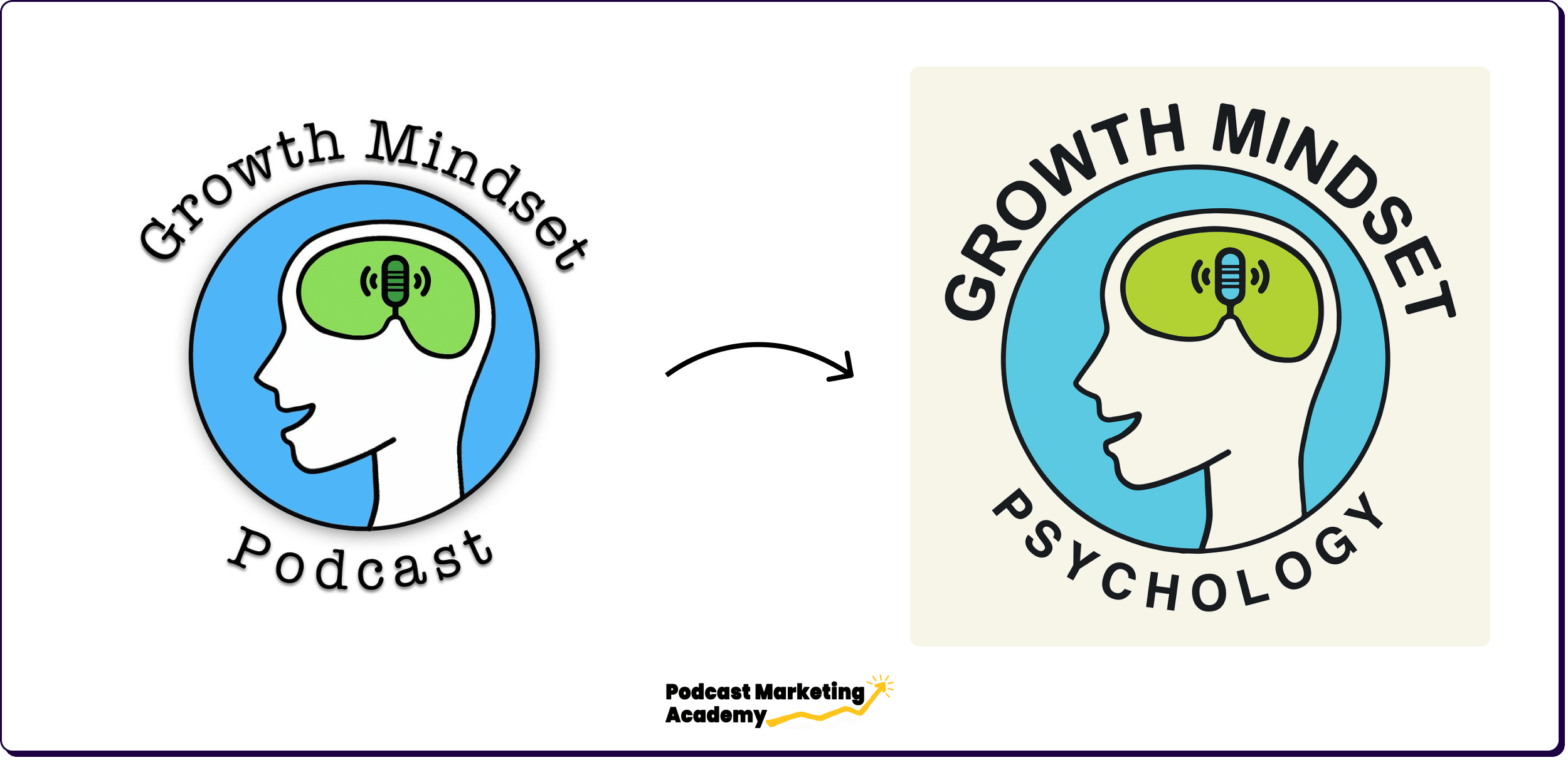
So much better than the original! The problems seem obvious now in hindsight, but at the time I couldn’t put a finger on what was wrong with it…
Results From The Podcast Cover Art Experiment
At a high level, the results of the new refresh were as follows:
- Apple saw about ~45% growth
- Spotify about ~25% growth
Breaking Down the Post-Experiment Podcast Data
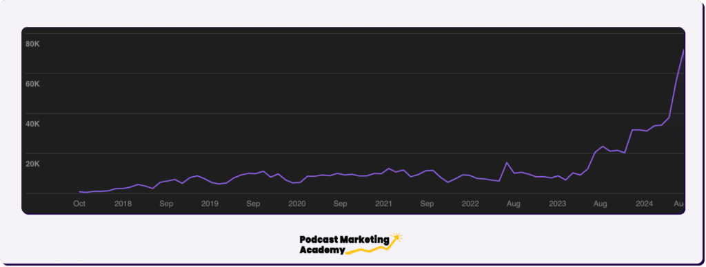
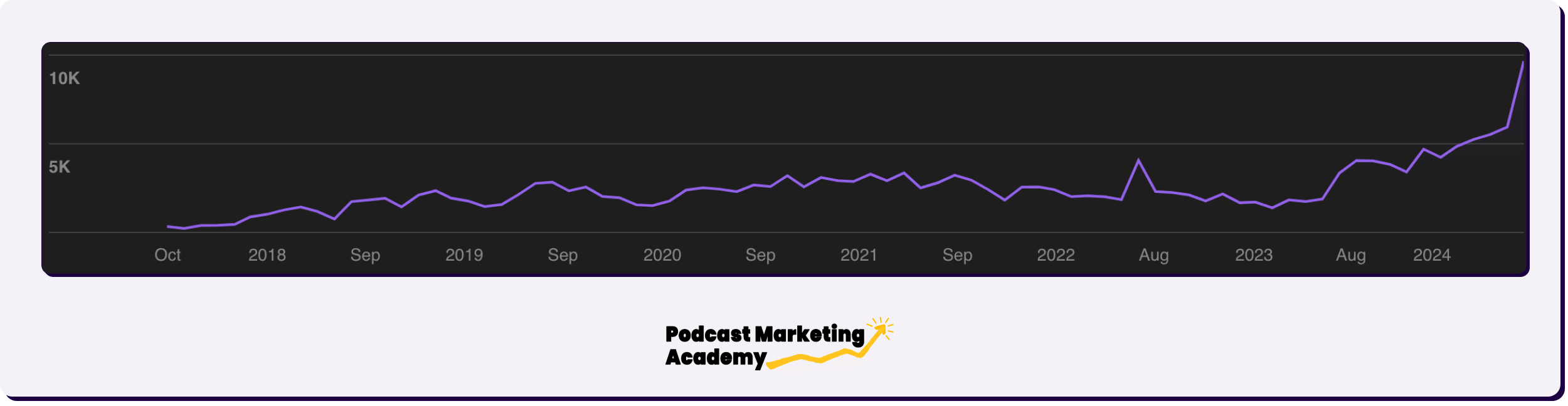
In the first month alone Apple Plays went up by 48% from 37,800 in June to 56,500 in July 🙃.
Update: A month later, they had climbed further to more than 72,000 plays in August.
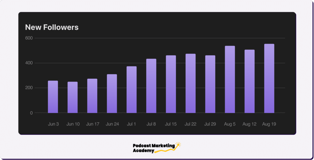
Apple Followers exploded from 1,100 new followers per month in June to almost 2,000 new followers in July.
Update: In August the new followers per week increased to more than 550.
Interestingly, Apple Listeners Per Month jumped from 5,900 in June to 9,800 in July.
So not only did I get 2,000 new listeners but re-activated 2,000 old ones.
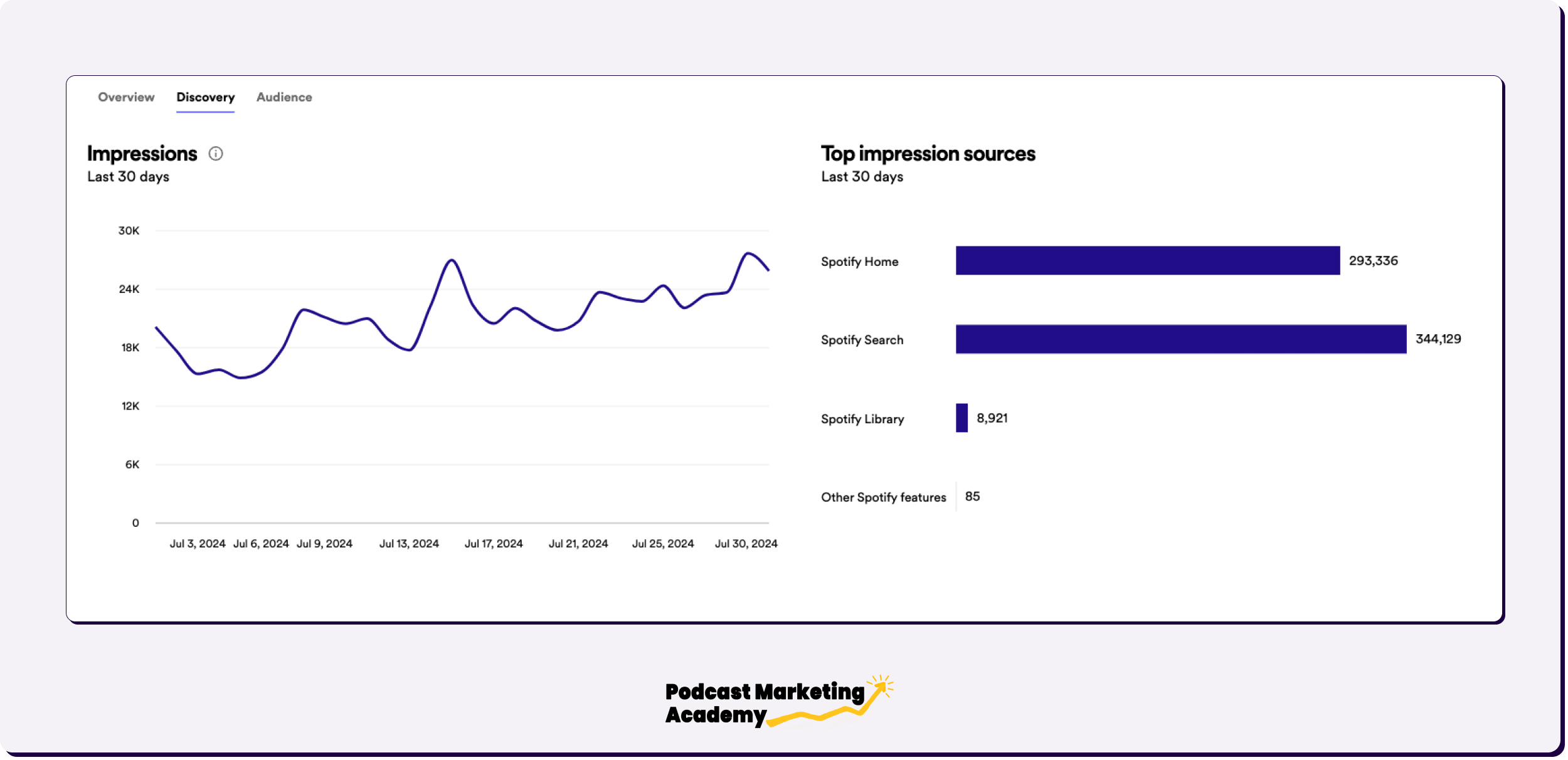
Spotify impressions went from 15-18k per day in June (not in graph) to a steady upwards trend to what is now around 25K per day.
Most of that growth appears to have come from search indicating that Spotify is more confident about my click-through rate based on impressions.
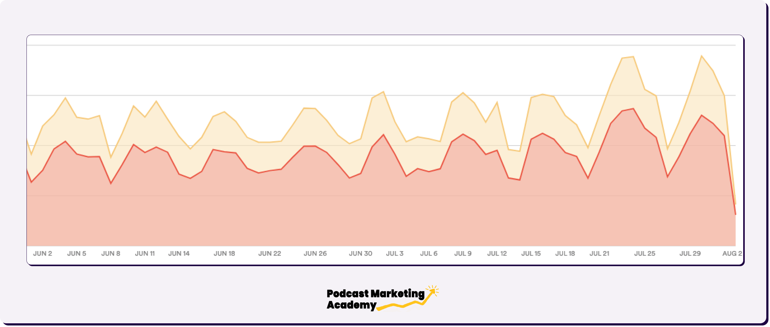
The Spotify daily downloads chart doesn’t look that different but I can’t show the weekly smoothed version.
The average was 650 a day and is now 850 a day, which is a monthly growth rate anyone would be happy with.
At the whole show level, you can explore my Open Analytics here.
Particularly striking to me is how the most recent episode hit 5,000 downloads within 3 days of release as opposed to 30 days, which was typical before the update 🤯.
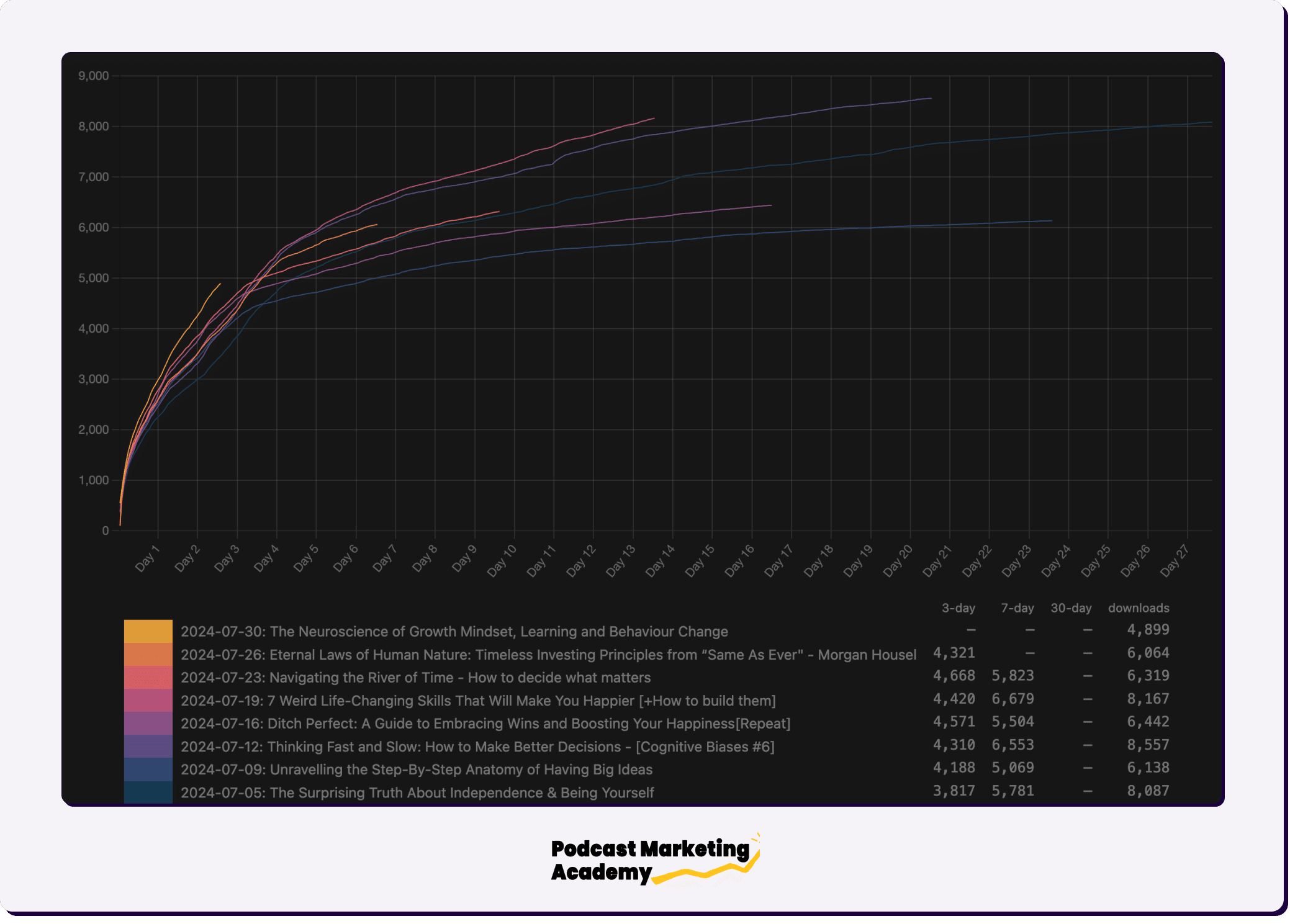
Generally, I prefer to take my analytics directly from the source with Apple and Spotify. My host, Megaphone, however, shows that the show went from 5-7K downloads per episode before the experiment to 7-9k downloads per episode after.
What’s more, the show grew on every platform except two.
Cover Art Experiment Post-Mortem: What I’d Do Differently?
It’s pretty much impossible to create a truly scientific experiment in podcasting given the absence of a static control group.
Even if you only make one small change to your show, you’re still releasing different episodes which could play a role in the results.
That said, there are two specific flaws with the experiment I ran.
- I spent a significant amount of time improving the titles in both my back catalog as well as my new episodes based on Jeremy’s audit advice.
- I’ve reduced from 3 episodes a week to 2 episodes a week. Publishing more episodes notably increased my exposure and new listener acquisition. It also gave me about 5,000 downloads a week extra across the whole show (my growth in May and June compared to April I think was largely due to 3 episodes per week).
My suspicion is that these changes counteract each other… but it’s hard to say which had the stronger effect.
Other issues with the experiment:
- I’ve also been releasing some longer episodes than usual, which have historically received a lot fewer downloads… and yet with better titles and better cover art, they’ve been some of my best-performing episodes ever 🤔
- I improved my show transition sound effects. I haven’t used them extensively yet, so I doubt they had a major effect… but they do give the show a slightly more polished vibe which may play a role in retaining more first time listeners and growing the overall base.
- I republished more old episodes than normal (3 out of 8 in this period) as a side test to see if I could get away with recycling content. I obviously can.
Lessons Learned From Redesigning My Podcast Artwork
- Don’t waste your designer’s time if you haven’t spoken to your audience to understand what they appreciate about the show and what they were looking for when they first subscribed.
- Don’t do a massive logo change without a very good reason, a lot of research, and a lot of ongoing communication with your audience about the update. I also started using the new artwork as my custom episode art for new episodes a month before making the official show-wide change.
- Don’t ask your friends, family, or network for advice. In most cases, they are not your listeners (or potential listeners) which makes their feedback entirely irrelevant.
- Don’t put your face on a logo just because you hear that’s what everyone else is doing or someone told you faces get clicks.
- Artwork can have a crazy impact on download numbers.
- Do double down on what is already working.

Phew.
Alright, Jeremy back again to round things out.
First off, I’m extremely grateful to Sam for writing this up and posting it in our Experiments channel inside Podcast Marketing Academy and then allowing me to massage it into a case study.
Your cover art is often the first impression a potential listener has of your show. Given that our brains process images faster than text, your artwork is quite possibly the single most important asset for attracting new listeners.
In short: Your artwork matters.
Regarding the impact of the change on Sam’s stats, however, one note to keep in mind:
Having a relatively big show with good SEO, Sam was already getting significant traffic (ie. visibility) in the podcast apps.
Which means even small tweaks have the potential to create big results.
If your show is only getting 100 impressions per week in Spotify, in other words, changing up your artwork isn’t going to immediately add hundreds of new listeners to your show.
But that doesn’t mean it’s not worth doing.
Rather than thinking about absolute listener growth, it’s worth thinking about growth in terms of percentages.
If you’re currently getting 250 downloads an episode, what changes can you make that bump up your numbers by 25%?
Or even just 5%?
The reality is that long-term growth is the product of a series of small—seemingly insignificant tweaks, upgrades, and experiments—that compound over time.
I hope this case study gave you some ideas for experiments you might be able to run—on your cover art or any other aspect of your show.
If you do, let me know and I’d love to do a similar write up and/or video case study.
Oh, and if you have further questions for Sam, you can send him a DM on Instagram or LinkedIn.
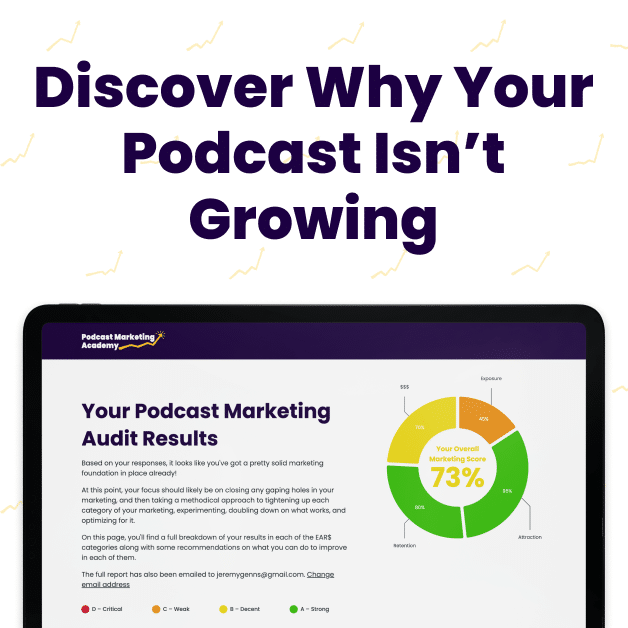
Get A Personalized Audit + Podcast Growth Plan
If you’re looking for an honest, no-punches-pulled assessment of why your show isn’t growing and/or converting clients & customers, followed by a personalized step-by-step gameplan for your show, consider signing up for a deep-dive podcast audit from me.
On these audits, I spend 10-15 hours studying every aspect of your show and then put together a 1.5–2-hour video report detailing the precise issues that are stifling your growth… as well as the opportunities hiding in plain sight, waiting for you to take advantage of them.
Following the audit, we’ll meet for 90 min to discuss the findings and next steps, then I build you a hyper-actionable, step-by-step growth plan showing you exactly what to do to get moving in the right direction.
There’s currently a 4-week waitlist to get started, but if you’re interested in getting more info and saving your spot in the queue, complete the application at the link below.